This is the first of what I hope will become a recurring selection built around a single visual theme. We’re starting with pickles, a category that, for a very long time, seemed quite comfortable looking old-fashioned.
Maybe it’s because I’m Turkish and grew up with pickles as part of everyday life, or maybe I simply enjoy seeing designers mess with one of the supermarket’s most traditional aisles. Either way, as a pickle lover, I’m quite pleased to see things changing.
Don’t expect a roundup of the newest pickle brands, or a definitive best-of. Some of these projects have been around for a few years, and there are plenty of others I could have included. These are simply a few that have stayed on my radar, each finding a different way to give a very ordinary jar of pickles a bit more personality.
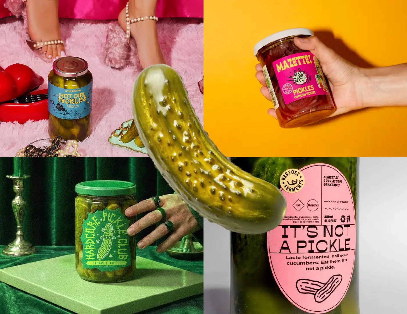
Hot Girl Pickles
by Gina Guasch Team and Playhouse
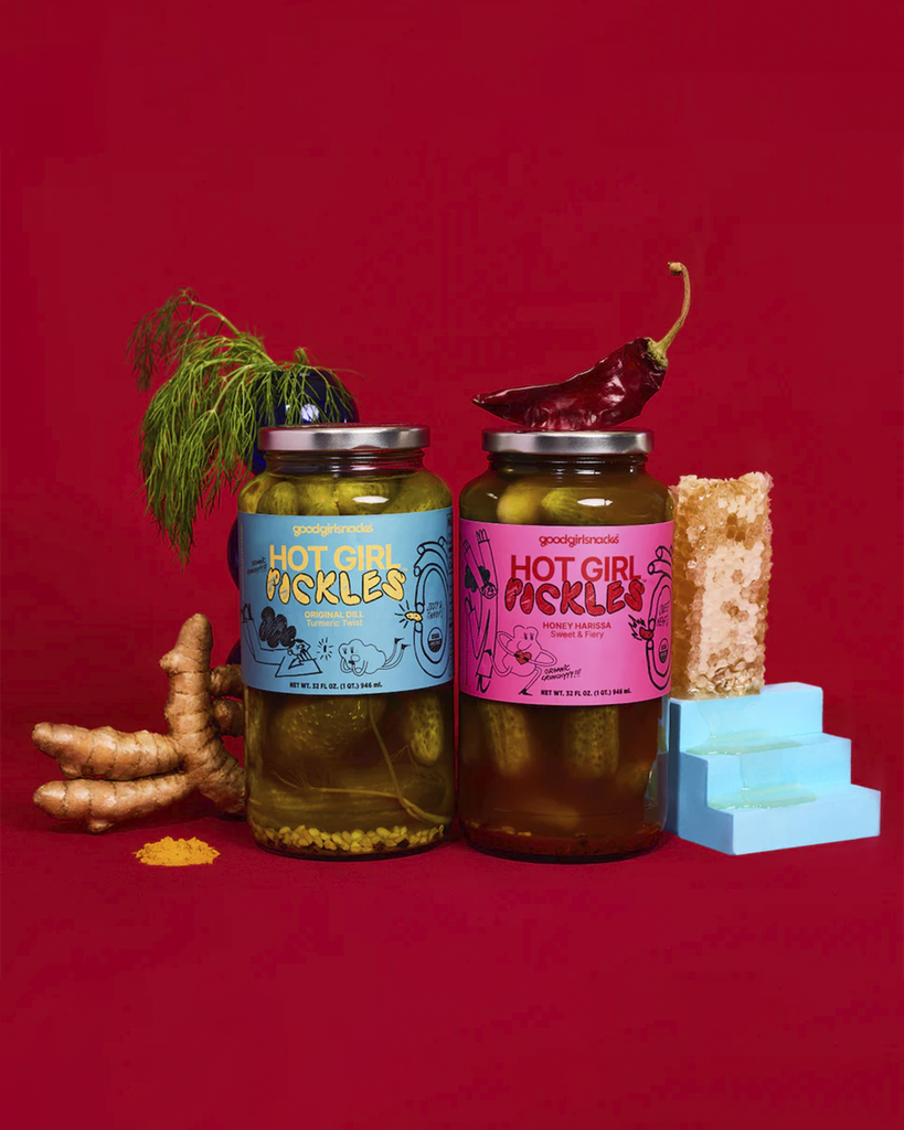
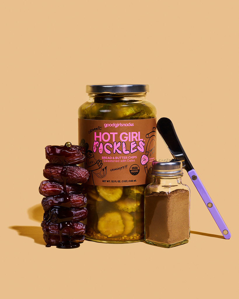
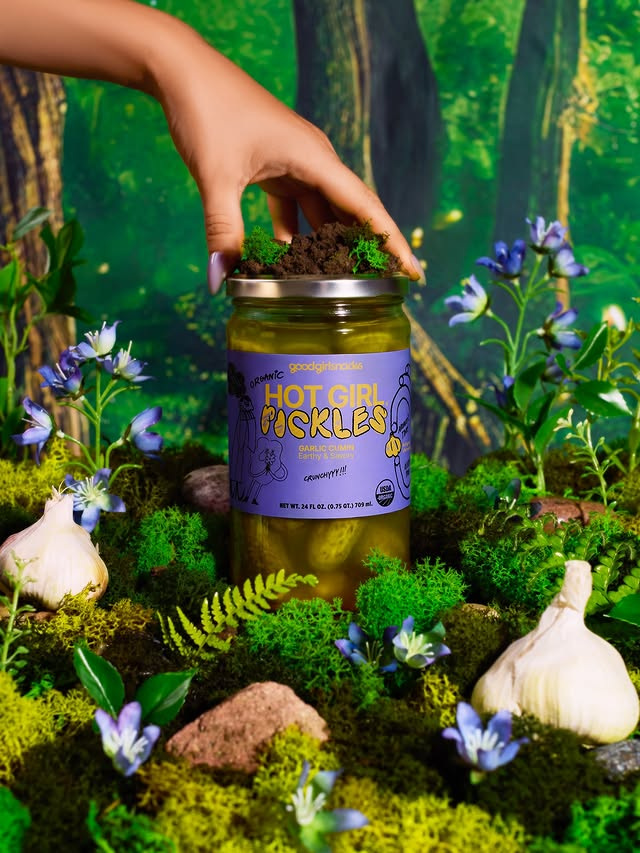
Hot Girl Pickles by Good Girl Snacks combines doodle illustrations, a bright color palette and a name that’s hard to miss. The identity and packaging were designed by Gina Guasch Team, with creative direction from founders Leah Marcus and Yasaman Bakhtiar, alongside Sofia Luna of Playhouse.
What catches my eye is how deliberately messy it looks, while still feeling organized. There’s a touch of maximalism to it that I like. Doodles and hand-drawn lettering are a familiar response to a client brief with “organic” in it, but the neon colors take it somewhere less expected.
MAZETTE!
by KIBLIND Agence
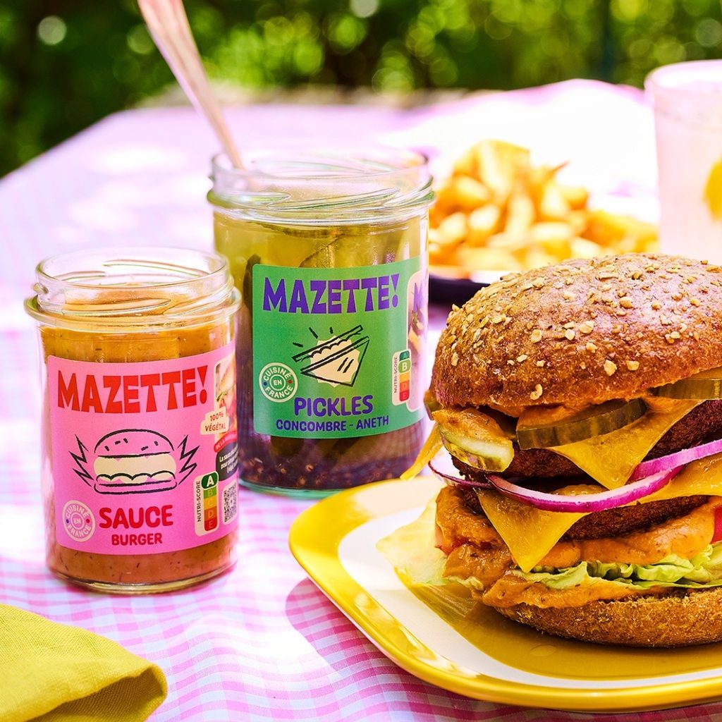
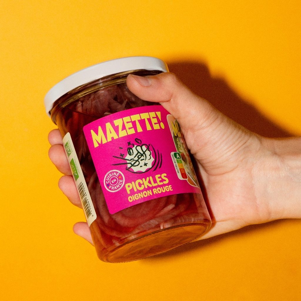
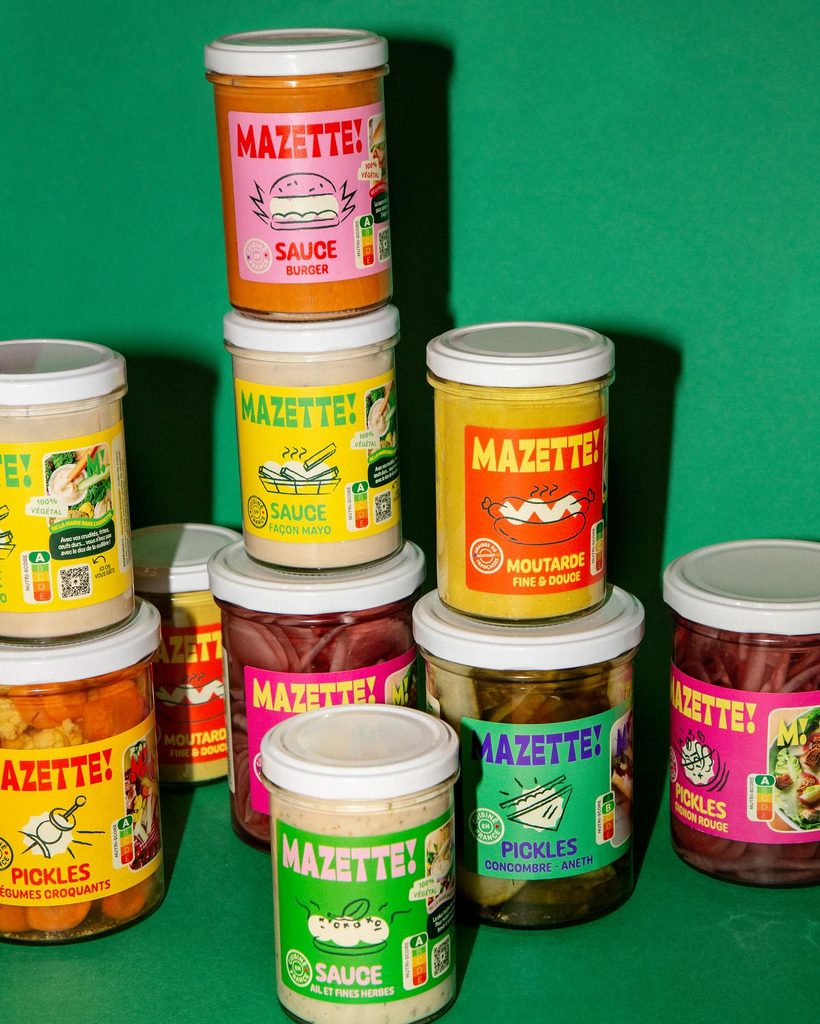
Mazette! makes much more than pickles, but I couldn’t resist including its packaging here. Once I saw it had a pickle range too, it was in. The brand identity and packaging were designed by KIBLIND.
The sharp, funky logotype is the hero, supported by a bright color palette that works well across the product range. Here too, the doodles soften the overall look, giving it a more human, organic feel. Apparently “organic” still needs a few hand-drawn lines to make the point. I especially like how the white shapes behind the drawings give them a sense of movement.
Hardcore Pickle Club
by TNT Creative Studio
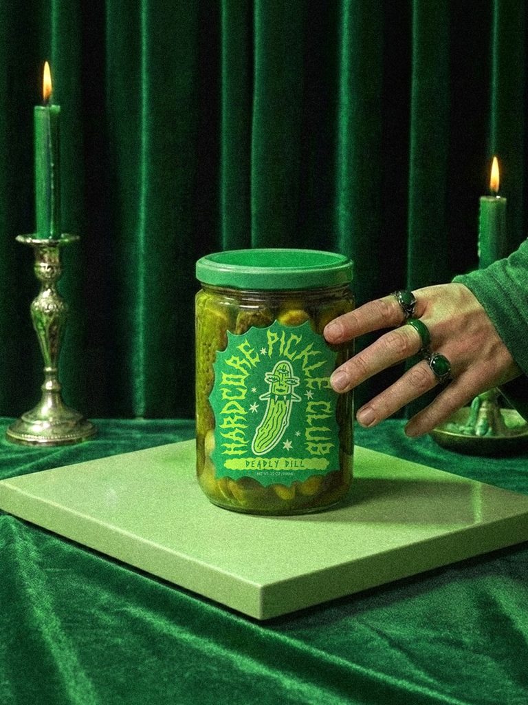
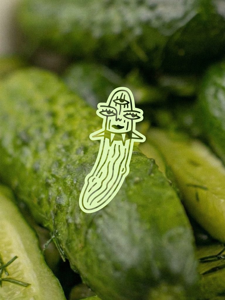
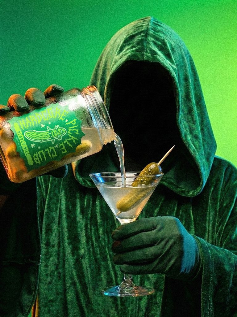
Hardcore Pickle Club takes me straight back to the days of Iron Maiden and Metallica, but somehow still manages to feel funky rather than nostalgic. The identity and packaging were designed by TNT Creative Studio, with illustrations by tattoo artist Mac the Fruitbat.
The heavy-metal crowd I grew up with may have thinned out over the years, so I quite enjoy seeing this visual language find its way into something aimed at a younger generation. The sharp, restless typography is balanced by what feels like every possible shade of green. Plus, naturally, the now almost obligatory hand-drawn touch. What I like most is the slightly rebellious pickle character and the irregular shape of the label around it. Together they push the whole thing further into that strange space between a pickle jar and a metal band sticker, which is probably exactly why it works for me.
Bartosz Ferments
by Bartosz Szymkiewicz
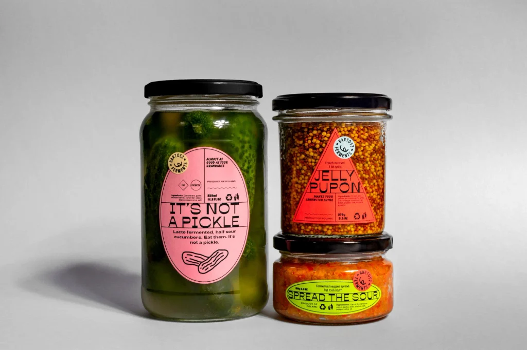
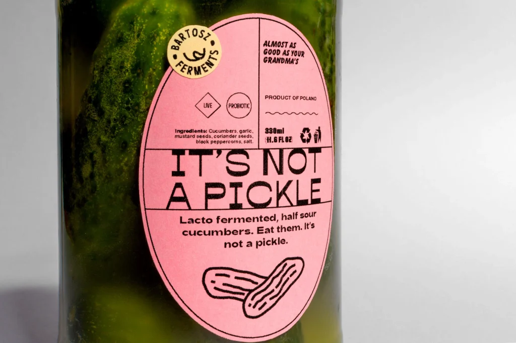
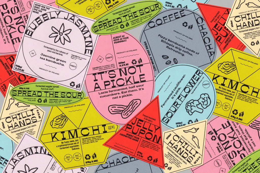
Bartosz Ferments is a self-initiated project by Bartosz Szymkiewicz, designed for his homemade fermented food. It reminds me of a moodboard we put together for a client back in 2022, exploring how different geometric forms could help distinguish products within the same range. So I’m slightly envious that Bartosz got there with his own ferments and turned it into a complete label system.
Color coding across a product range is nothing new, but it’s something I’ve always liked, especially when it’s combined with different geometric shapes and semi-structural contrast typography. Bartosz brings all of those ingredients together into a system that feels remarkably coherent. The quieter strength of the design is the grid. On the pickle label, much of the necessary product information sits above the product name, which is not the hierarchy I would normally expect, but it works surprisingly well here. The different compartments give a lot of information somewhere to go without making the label feel overly structured.
And finally, we almost made it through one pickle project without a doodle. But there it is again, waving back at me. In this case, though, I’d actually prefer the pickle illustration not to be there. That lower space doesn’t feel like it needs filling, and the label is strong enough without it.